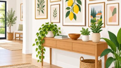
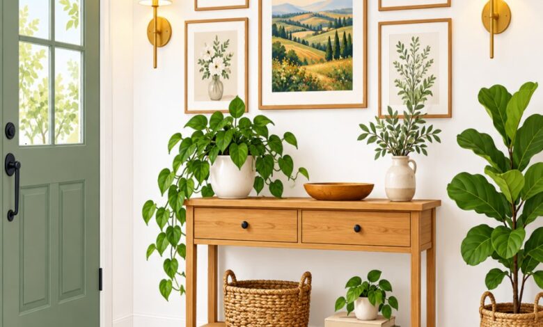
Your entryway is the handshake of your home, and nothing undermines a warm welcome faster than a wall of mismatched frames slapped up without a plan. Across thousands of homes, the same gallery wall design mistakes keep showing up, quietly dating spaces that are otherwise beautifully modern. If your foyer feels more cluttered than curated, you are not alone, and the good news is every one of these missteps is fixable with a little intention.
In this guide, we are breaking down ten terrifying habits that make a gallery wall look tired instead of trendy. We will walk through spacing, scale, framing, lighting, and placement blunders, and show you exactly how to correct each one. By the end, you will have a clear roadmap for building a modern entryway art display that feels intentional, cohesive, and genuinely welcoming.
Essential Guide to gallery wall design mistakes
Mistake #1: Ignoring Art Hanging Spacing Rules Entirely
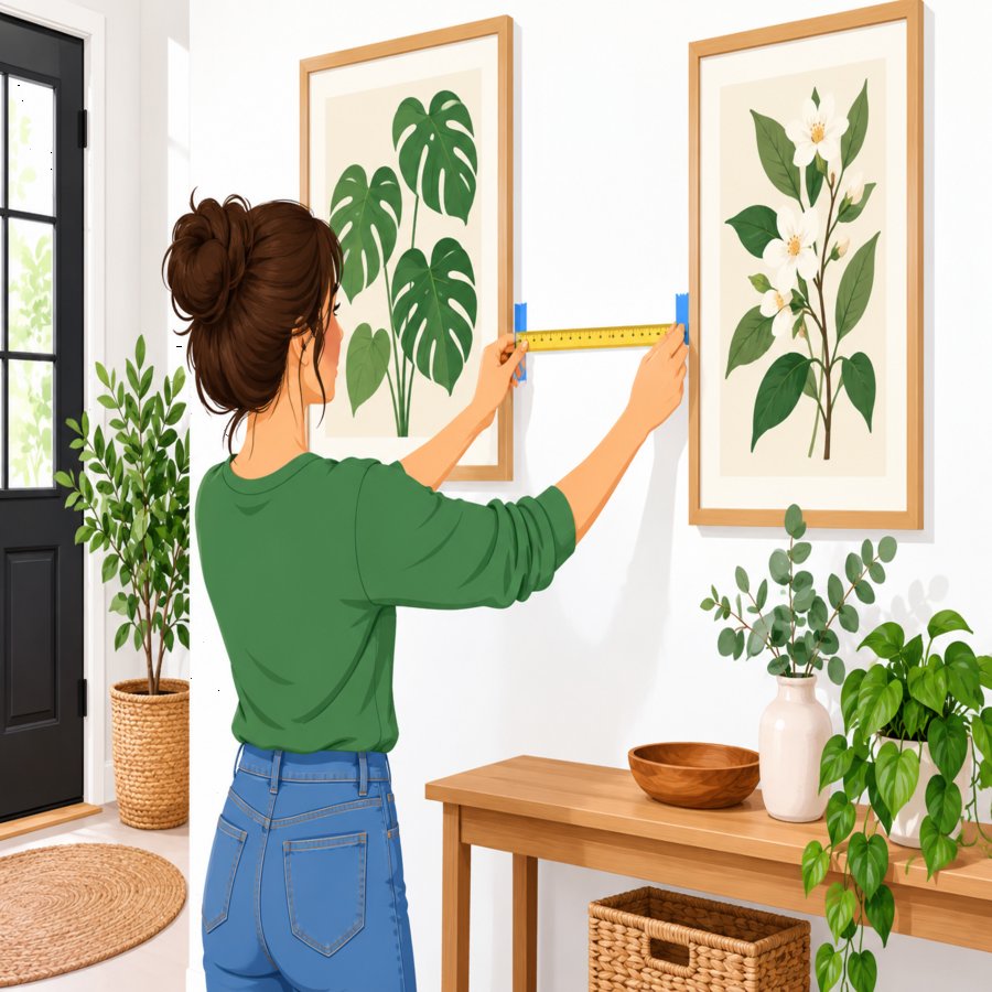
The single most common offender among gallery wall design mistakes is inconsistent gap sizing between frames. When some pieces sit two inches apart and others sit eight inches apart, the eye cannot settle, and the whole arrangement reads as accidental rather than curated.
The Fix: Proper art hanging spacing should stay between two and three inches consistently, no matter how many frames you are working with. Grab a ruler, not your gut instinct, and measure every gap before you commit to a nail.
Lay your entire arrangement out on the floor first using painter’s tape to mark the wall dimensions. This single habit prevents nearly every spacing disaster before it happens.
Mistake #2: Hanging Everything Too High
There is an old instinct to hang art near the ceiling, as if height alone signals grandeur. In reality, this is one of the most glaring framed decor blunders because it disconnects the art from the furniture and the people walking beneath it.
The Fix: The center of your gallery wall, or the center of your focal piece, should land at roughly 57 to 60 inches from the floor, which is standard eye level. In an entryway, where people are moving rather than sitting, this number holds steady and should not be adjusted upward.
If you are hanging above a console table, leave six to eight inches of breathing room between the furniture top and the lowest frame. This keeps the composition grounded instead of floating awkwardly near the crown molding.
Mistake #3: Mixing Frame Finishes Without a Unifying Thread
Gold, black, brushed nickel, and raw wood frames can absolutely coexist, but only when there is a deliberate reason for each one being there. Randomly combining every frame you own is a classic entryway trap that instantly ages the space.
The Fix: Pick one dominant finish to anchor at least 60 percent of your frames, then allow one or two accent finishes to appear in smaller doses. This creates variety without visual chaos, a principle that separates curated collections from cluttered ones.
If you are staging your home for sale, this kind of cohesive finish strategy matters even more, since buyers respond to spaces that feel put-together. For more guidance on presenting rooms at their absolute best, check out these expert home staging tips for a polished first impression.
Mistake #4: Choosing Mats and Frames That Fight the Art
Thick, glossy, ornate frames around minimalist line art, or razor-thin modern frames around rustic botanical prints, create a visual argument that nobody wins. This mismatch is one of the more subtle but persistent framed decor blunders homeowners overlook.
The Fix: Let the art dictate the frame style, not the other way around. Soft watercolor botanicals pair beautifully with slim wood or matte black frames, while bold graphic prints can handle a slightly heavier profile.
Mat boards matter too. A plain white or cream mat with a two to three inch border almost always reads as more sophisticated than a colored or patterned mat competing with the artwork itself.
Mistake #5: Forgetting Scale Relative to the Wall
A collection of tiny four-by-six frames scattered across a ten-foot entryway wall looks lost and unfinished. This is a scale problem, and it ranks among the top gallery wall design mistakes because it makes an otherwise impressive wall feel like an afterthought.
The Fix: A gallery wall arrangement should occupy roughly 60 to 75 percent of the available wall width and anchor visually to the furniture beneath it. If your frames are small, add more of them, or mix in one or two larger anchor pieces to establish presence.
Measure your wall before shopping for art. Walking into this project without dimensions in hand is how most scale disasters begin.
Mistake #6: Skipping a Layout Plan Before Drilling
Freehanding a gallery wall directly onto drywall, one nail at a time, is a gamble that rarely pays off. Patch jobs from misplaced holes are one of the most physically damaging gallery wall design mistakes, leaving behind a wall full of plaster scars.
The Fix: Trace each frame onto kraft paper, cut out the shapes, and tape them to the wall in your proposed arrangement. Step back, live with it for a day, and adjust before a single nail goes in.
This paper template method, long championed by professional stagers and designers, eliminates guesswork entirely and lets you commit with confidence.
Mistake #7: Neglecting Lighting for Modern Entryway Art
Entryways often rely on a single overhead fixture, which casts flat, uneven light across a wall of frames. Beautiful modern entryway art loses nearly all of its impact when it sits in shadow or glare.
The Fix: Add a dedicated picture light, a slim LED strip, or a well-placed wall sconce to wash light evenly across your display. Warm-toned bulbs around 2700K flatter most artwork far better than cool, clinical light.
Natural light matters too. If your entryway has a nearby window, avoid hanging valuable prints in direct sun exposure, since UV rays fade pigments over time, a detail even the Royal Horticultural Society notes when discussing sunlight damage to botanical prints and pressed specimens displayed indoors.
Mistake #8: Overcrowding Without Visual Breathing Room
More is not always more. Cramming twenty frames onto a narrow entryway wall with zero negative space overwhelms visitors the moment they walk in, and it is one of the most exhausting gallery wall design mistakes to live with daily.
The Fix: Edit ruthlessly. Choose quality over quantity, and allow the wall color itself to act as a frame around your arrangement. A gallery wall with twelve well-placed pieces and generous margins always outperforms twenty crammed together.
Leave at least four to six inches of clear wall space surrounding the entire arrangement so it reads as one cohesive composition rather than a sprawling collage.
Mistake #9: Choosing Art That Does Not Reflect Your Home’s Story
Generic stock-style prints bought in a matching three-pack rarely feel personal, and guests can tell the difference instantly. Entryways benefit most from art that hints at who actually lives there.
The Fix: Mix in travel photography, a child’s framed artwork, a pressed botanical specimen, or a vintage map alongside your purchased prints. According to design experts at Better Homes & Gardens, the most memorable gallery walls combine personal keepsakes with cohesive framing, striking a balance between polish and personality.
This blend keeps your entryway from feeling like a furniture showroom while still maintaining the organized structure that makes gallery walls work.
Mistake #10: Never Revisiting the Arrangement
A gallery wall hung once in 2015 and never touched since is bound to feel dated, no matter how good the original layout was. Trends shift, families grow, and tastes evolve, yet the wall stays frozen in time.
The Fix: Treat your gallery wall as a living project. Swap in seasonal art, rotate a few frames annually, or refresh mats and finishes every few years to keep the display feeling current.
Small, periodic updates prevent the biggest gallery wall design mistakes from creeping back in gradually, since fresh eyes catch spacing drift and clutter before it becomes permanent.
Putting It All Together for a Flawless Entryway
Correcting these ten habits transforms a chaotic wall into a genuinely impressive first impression. The goal is not perfection on the first attempt, but rather a willingness to measure, plan, and adjust until the composition feels balanced.
Start with your layout plan on paper, commit to consistent spacing, choose a unifying frame finish, and add proper lighting. These four steps alone resolve the majority of common gallery wall design mistakes seen in modern homes today.
Your entryway deserves the same thoughtful attention as any other room in the house. With these fixes in hand, you are fully equipped to build a gallery wall that welcomes every guest with confidence rather than clutter.