
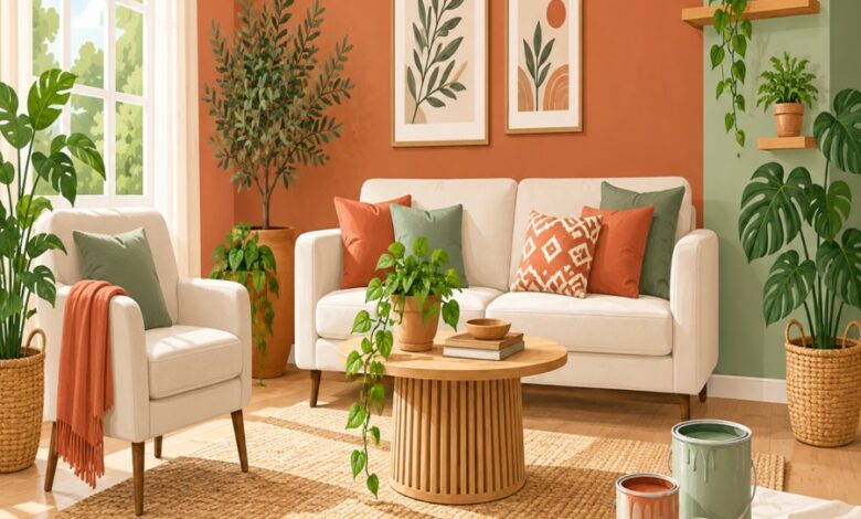
Color drenching has taken over design feeds everywhere, and it’s easy to see why. Saturating a room from ceiling to baseboard in a single, confident hue feels bold, cohesive, and undeniably stylish. But when your square footage is limited, this trend can backfire fast. Small living rooms are especially vulnerable to color drenching mistakes that shrink the space, kill natural light, and leave the whole room feeling like a padded box rather than a cozy retreat. Before you commit a single gallon of paint, let’s walk through the seven most common missteps homeowners make and exactly how to avoid them.
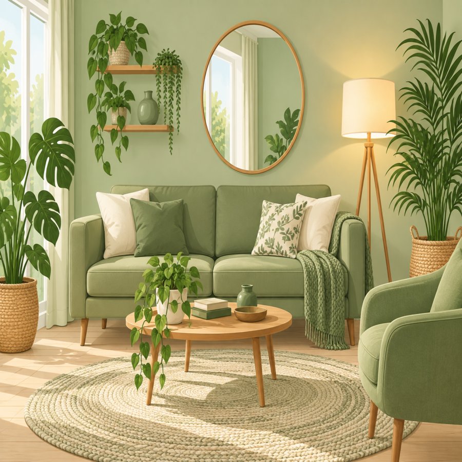
Essential Guide to color drenching mistakes
What Color Drenching Actually Means (And Why Small Rooms Are Tricky)
Color drenching is the practice of painting walls, trim, ceiling, and sometimes even doors in one unified color. The goal is to eliminate visual breaks so the eye flows seamlessly around the room. In large, light-filled spaces, this technique creates a cocoon-like warmth that feels intentional and designer-approved.
The problem is that small living rooms don’t have the luxury of extra square footage to absorb a dramatic hue. Every wall, every corner, and every shadow is amplified. One of the most frequent color drenching mistakes is assuming the technique works identically regardless of room size, when in reality, proportion changes everything.
Why scale matters
A deep hue in a 20-by-20-foot great room reads as moody and sophisticated. The same color in a 10-by-10-foot living room can feel claustrophobic within minutes. Understanding this distinction is the first step toward avoiding the rest of the mistakes on this list.
Mistake One: Choosing a Color That’s Too Dark for Low Light
The single most damaging of all color drenching mistakes is picking a saturated, dark shade for a room that already struggles with natural light. Charcoal, deep navy, and forest green look stunning in paint swatches and on Pinterest boards. But without ample windows, these tones absorb light instead of bouncing it around the room.
Test your chosen color at multiple times of day before committing. Paint a large sample board and move it around the room from morning to evening. If the color looks muddy or flat under your existing lighting, it will only intensify once it covers every surface.
A better approach
Opt for mid-tone, warm-leaning hues like terracotta, sage, or warm greige. These shades carry the same enveloping effect as darker colors but reflect enough light to keep the room from feeling like a cave. According to the Better Homes & Gardens design team, mid-tone saturated colors are increasingly favored for small spaces precisely because they balance drama with livability.
Mistake Two: Ignoring Ceiling Height and Trim Proportions
Standard eight-foot ceilings are common in smaller homes, and drenching them in the same bold color as the walls without a plan can visually compress the room. Many homeowners skip strategic paint techniques that would otherwise help “lift” a low ceiling, and instead apply color uniformly without considering how trim and crown molding interact with the hue.
One fix is to paint the ceiling a shade lighter than the walls rather than matching it exactly. This subtle gradient tricks the eye into perceiving more height. Alternatively, running the wall color up and over the ceiling in a slightly glossier finish can create a soft reflective quality that counters the room’s low stature.
Trim decisions matter too
Painting baseboards and window casings the exact same color as the walls is part of true color drenching, but skipping a satin or semi-gloss sheen on those details is a missed opportunity. The slight sheen variation adds dimension without breaking the monochrome effect.
Mistake Three: Forgetting the Power of Paint Techniques and Finish
Not all color drenching looks the same, and finish choice is where many DIYers fall short. Flat finishes absorb light and can make a small room feel heavier and duller than intended. Pairing the wrong sheen with the wrong paint techniques is a surprisingly common misstep that undermines an otherwise well-chosen color.
Eggshell or satin finishes strike the right balance for most living rooms. They offer gentle light reflection without highlighting every imperfection on the drywall. For rooms that get heavy foot traffic or little natural light, a slightly higher sheen on the lower half of the walls can bounce more light back into the space.
Experiment before you commit
Paint two small boards in the same color, one in matte and one in satin, and compare them under your room’s lighting. The difference is often more dramatic than homeowners expect, and it can completely change how the drenched color performs throughout the day.
Mistake Four: Overcrowding Small Living Room Decor With Competing Tones
Once the walls are drenched, it’s tempting to layer in bold patterned rugs, mismatched throw pillows, and busy artwork. Unfortunately, this is one of the quickest ways to sabotage otherwise thoughtful small living room decor. When every surface competes for attention, the drenched color loses its calming, unifying effect.
The most successful drenched rooms rely on a restrained palette of textures rather than competing colors. Think linen, boucle, rattan, and brushed metal finishes layered in neutral or tonal shades that complement the wall color instead of fighting it.
Curating instead of collecting
Choose two or three accent colors maximum and repeat them intentionally across pillows, throws, and art. This disciplined approach keeps small living room decor feeling curated rather than cluttered, letting the drenched walls remain the star of the show.
Mistake Five: Treating Monochrome Interior Design as “One Flat Color”
True monochrome interior design isn’t about slapping a single shade everywhere and calling it done. It’s about layering tints, tones, and shades of the same hue family to create depth. Skipping this nuance is one of the more subtle color drenching mistakes, but it’s also one of the most noticeable once the paint dries.
A successful monochrome interior uses the base wall color as an anchor, then introduces lighter and darker variations through furniture, textiles, and accessories. A sage green room, for example, might include olive upholstery, pale celery curtains, and deep moss accent pillows. This tonal layering prevents the room from feeling flat or one-dimensional.
Adding depth with materials
Incorporate varied textures like woven baskets, matte ceramics, and glossy glass vases in the same color family. The interplay of light-catching and light-absorbing surfaces adds dimension that a single flat coat of paint simply cannot achieve on its own.
Mistake Six: Skipping Strategic Lighting Before Drenching the Room
Lighting and color are inseparable, yet lighting is often an afterthought in the planning process. Relying solely on a single overhead fixture after drenching a room in deep color is a recipe for disappointment. Darker, saturated walls need layered lighting to prevent the room from feeling dim and uninviting after sunset.
Before committing to your final color, map out where floor lamps, table lamps, and wall sconces will live. Warm-toned bulbs in the 2700K to 3000K range typically complement drenched rooms far better than cool white light, which can make saturated colors look harsh and artificial.
Don’t forget mirrors
Strategically placed mirrors bounce both natural and artificial light around a drenched room, helping to counteract the light-absorbing nature of deeper colors. Position one across from your main window to maximize the reflective benefit throughout the day.
Mistake Seven: Rushing the Project Without Proper Prep Work
Perhaps the most avoidable of all color drenching mistakes is skipping proper surface preparation in the excitement to see the finished look. Drenched rooms rely on flawless, uniform application, which means any dents, cracks, or uneven textures become far more visible once the entire room shares one continuous color.
Take time to patch holes, sand rough spots, and apply a quality primer before the first coat of color goes on. Skipping primer is especially risky when transitioning from a dramatically different existing color, since the undertone can bleed through and distort your new drenched hue.
Budget-friendly prep tips
If you’re already working through a home refresh on a budget, it’s worth reviewing broader cost-effective renovation ideas, including this guide to affordable upgrades that add instant value to your home, which offers plenty of transferable tips for stretching your paint and renovation budget further.
How to Test Your Color Before Committing the Whole Room
Avoiding color drenching mistakes ultimately comes down to testing before committing. Paint large sample boards, at least two feet by two feet, rather than relying on tiny swatches. Move these boards to different walls and observe them morning, afternoon, and night.
Photograph the samples with your phone and view them in black and white. This trick removes the distraction of color and reveals the true value, or lightness and darkness, of your chosen shade relative to your furniture and flooring.
Consider the whole flow
If your living room opens into a hallway, kitchen, or dining area, think about how the drenched color will transition into those adjacent spaces. A jarring, abrupt color change at a doorway can make the whole home feel disjointed rather than intentionally designed.
Final Thoughts: Drenching Done Right Still Feels Spacious
Color drenching can absolutely work in a small living room when it’s approached thoughtfully. The key is balancing boldness with the practical realities of light, scale, and proportion unique to compact spaces. Avoiding these seven color drenching mistakes doesn’t mean playing it safe with beige forever; it simply means being intentional about every decision from sheen to lighting to accent layering.
For further inspiration on color theory and seasonal palette trends, the Royal Horticultural Society offers excellent resources on how natural light and garden-inspired hues translate beautifully into interior spaces as well.
Approach your next painting project with patience, proper testing, and a willingness to layer texture and light. Do that, and your small living room will feel every bit as expansive, cohesive, and stylish as the biggest drenched spaces on your inspiration board.